
Branding, website & graphic design case studies.
Every project is different, but they all have one thing in common: thoughtful design that helps businesses stand out, connect with their audience and grow with confidence.
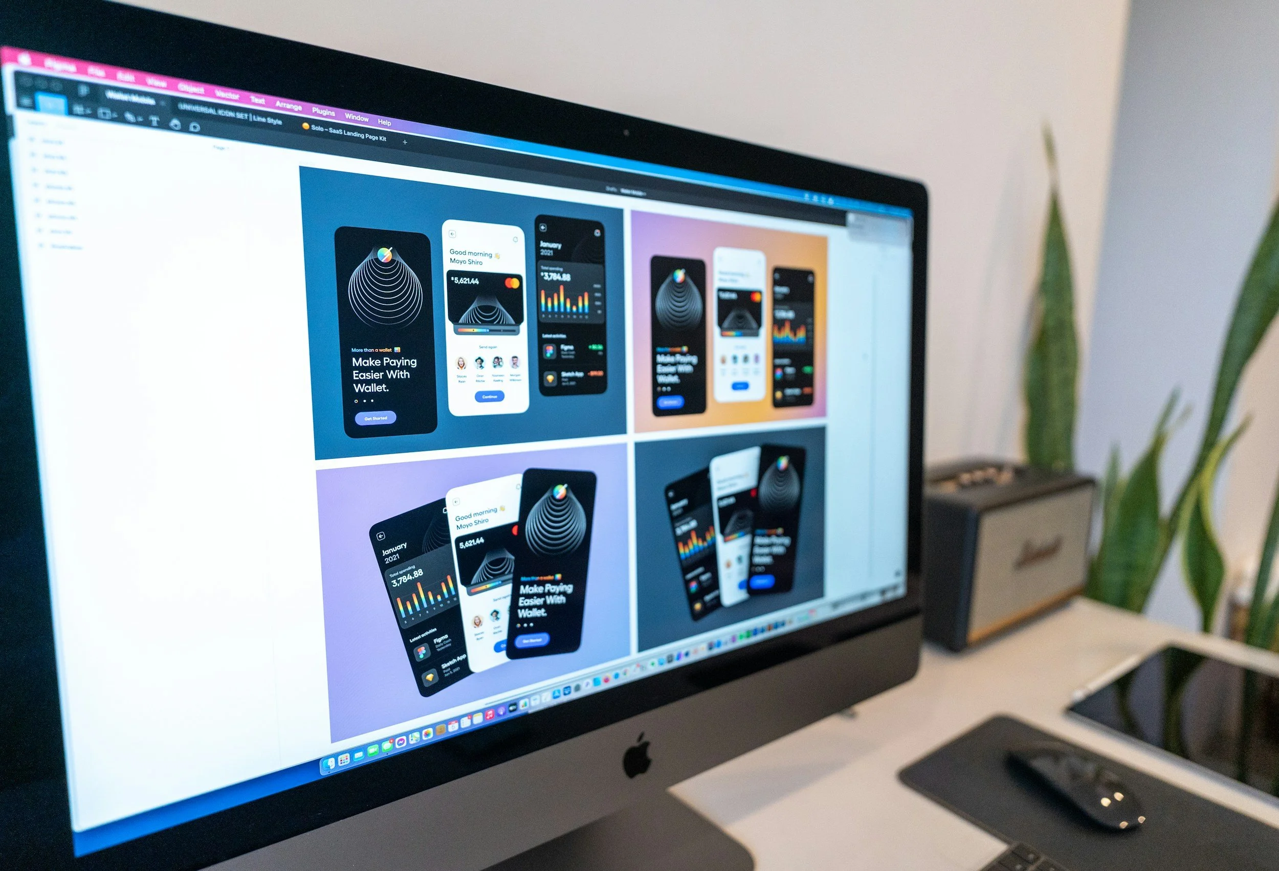

JHET — Brand identity & website refresh
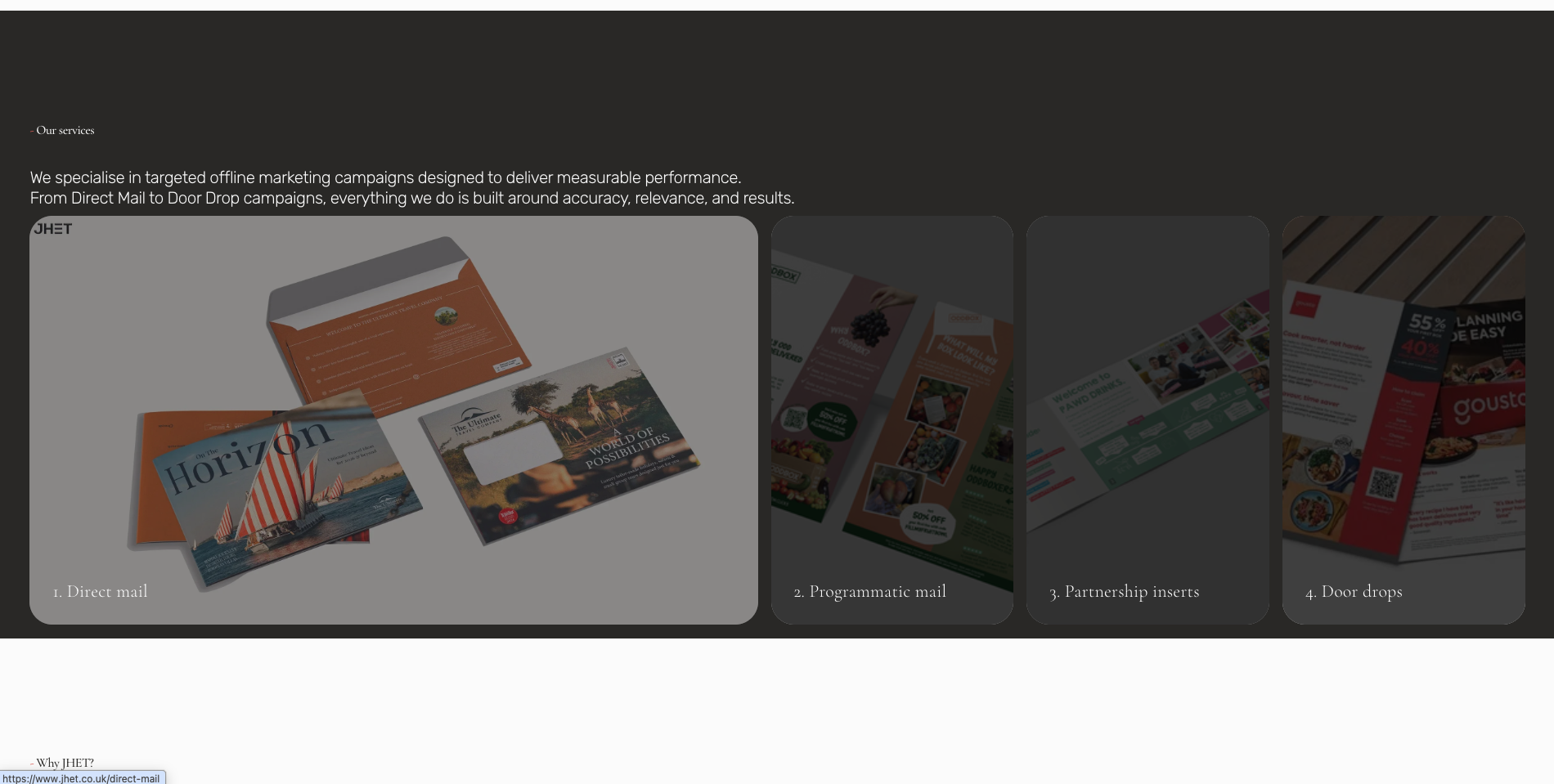
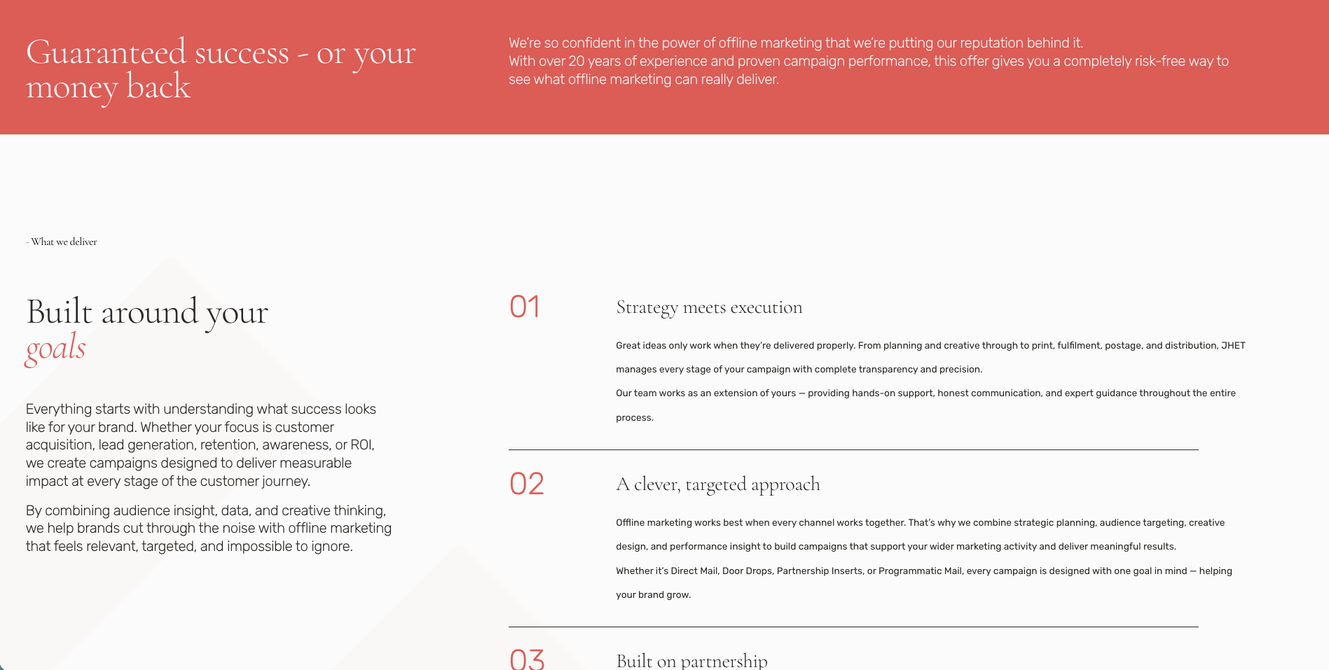
JHET had built a great reputation, but their brand identity wasn't showing the quality of the work they were producing. Over the years, things had become a little inconsistent, with different colours, fonts and styles creeping in, making the brand feel less polished than it should.
Their website had the same problem. It felt dated, was difficult to navigate and didn't really capture who they are or the way they work. The copy was full of generic marketing language, rather than sounding like the knowledgeable, approachable team behind the business.
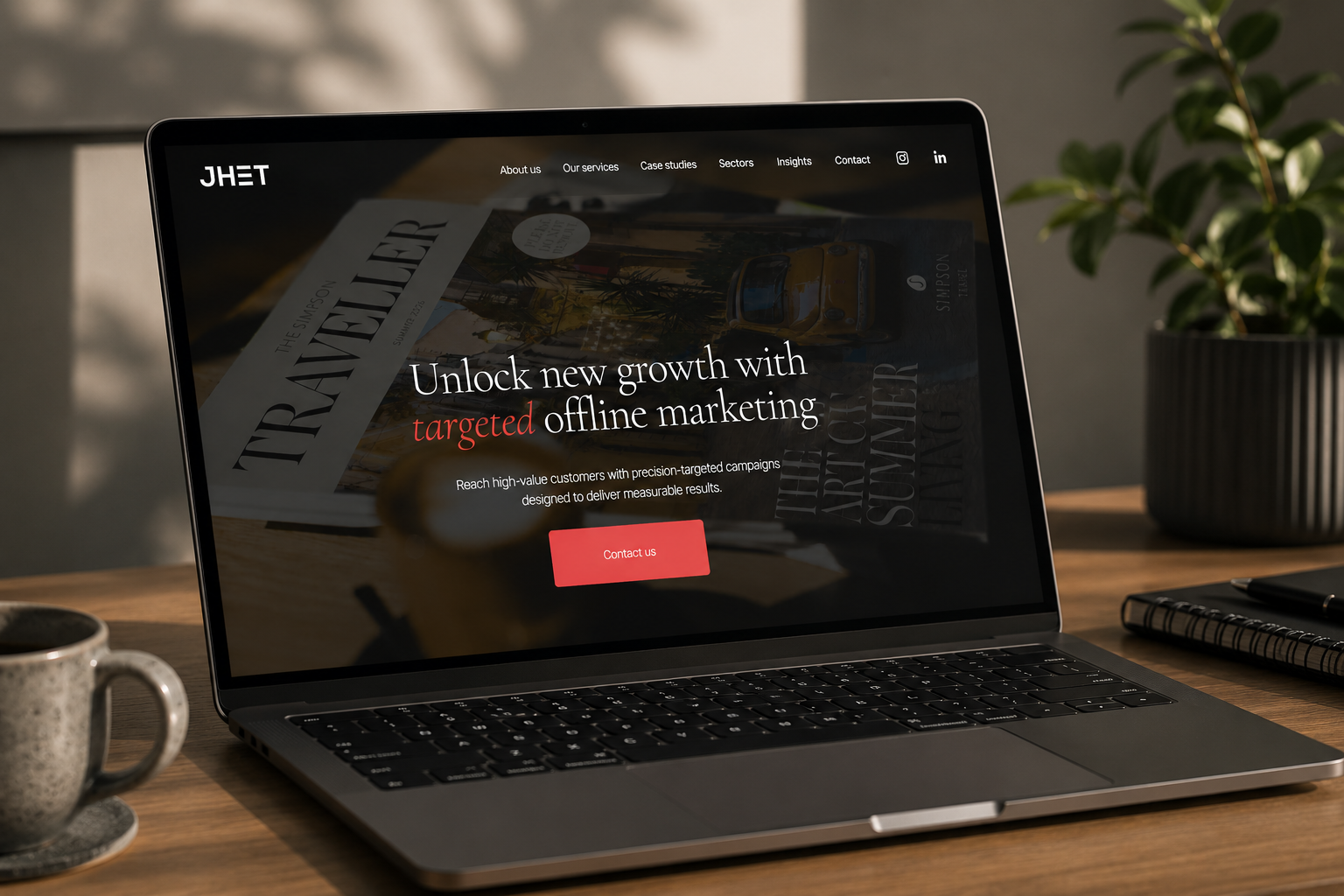
They needed a brand and website that felt modern, consistent and confident, something that would appeal to the type of clients they wanted to work with and better reflect the quality of their work.
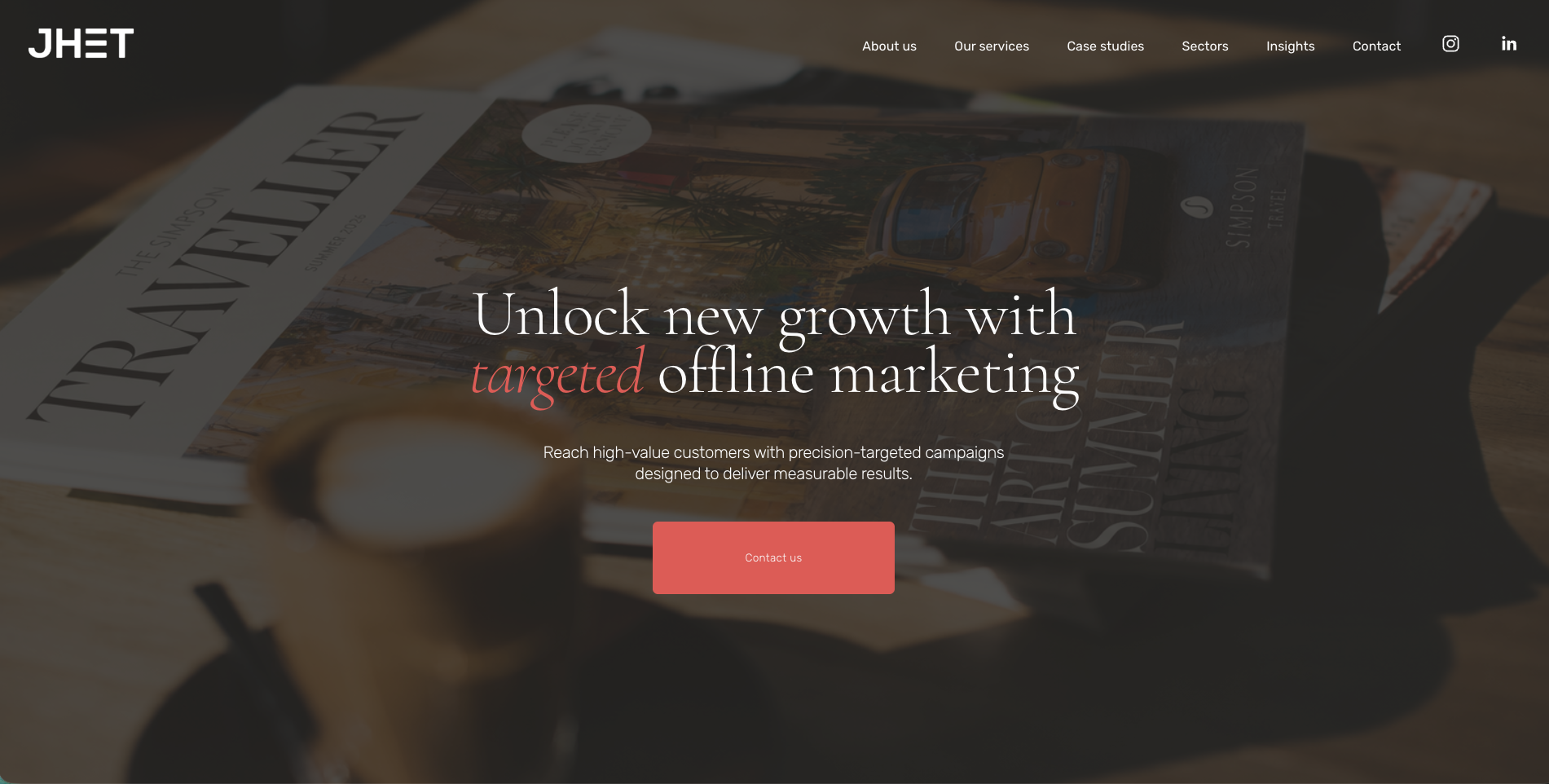
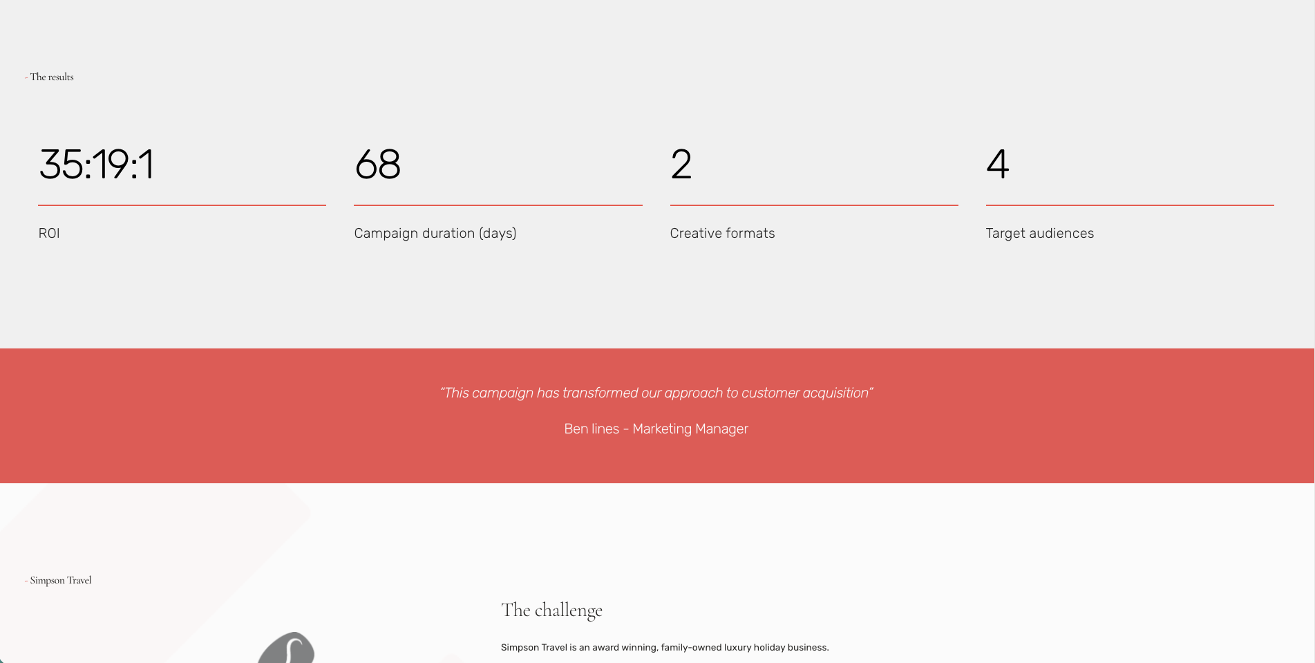
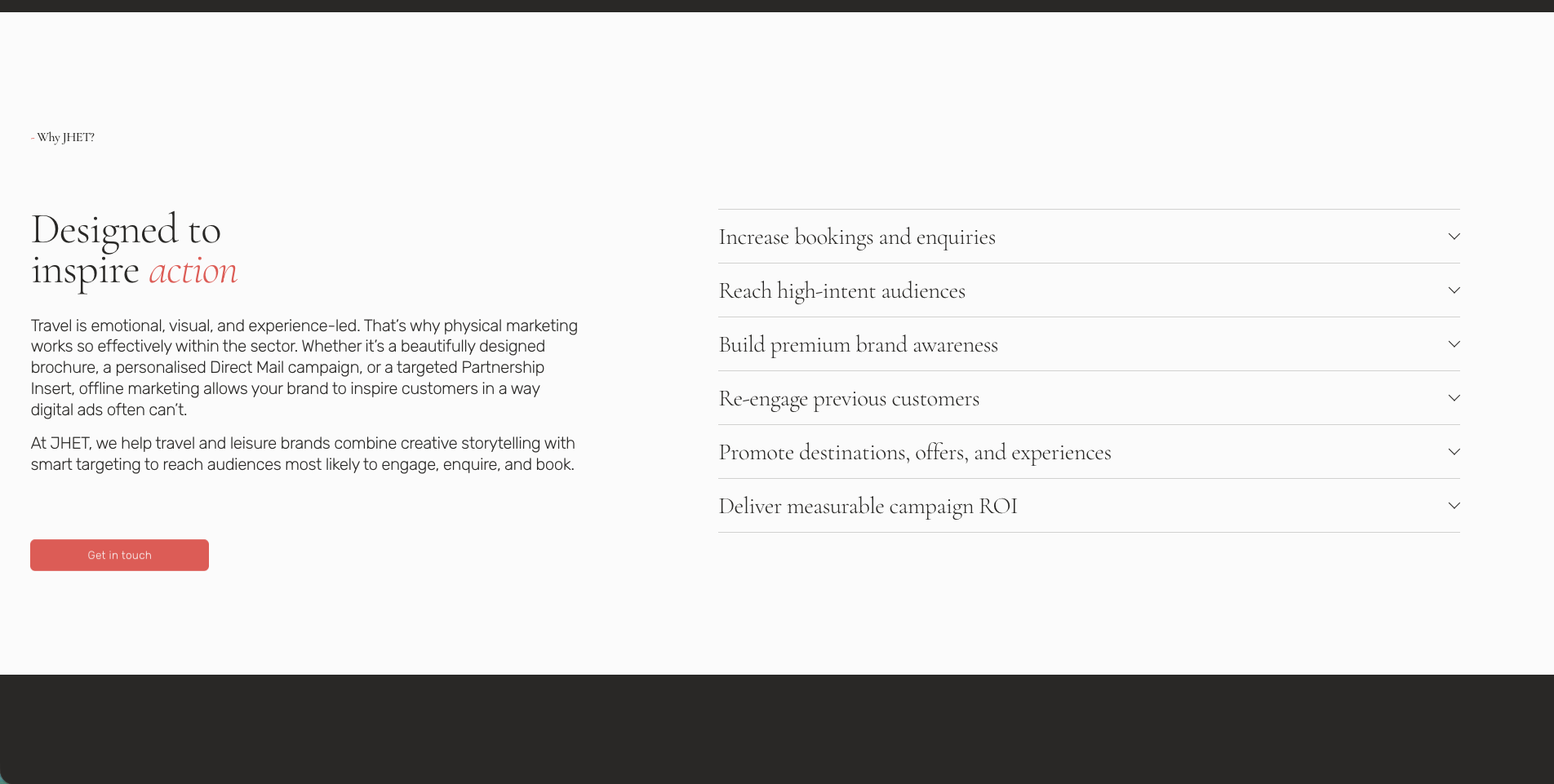
What I did.
I refreshed the brand without losing what made it recognisable, refining the colour palette, introducing a new serif typeface and creating clear brand guidelines to bring everything together.
I then designed and built a completely new Squarespace website with modern styling and intuitive navigation, before rewriting the copy to sound more like JHET and less like generic marketing.
"Working with Lucy was exactly what we needed. She took the time to understand our business and transformed our brand without losing who we are. The new website feels modern, the messaging finally sounds like us, and we've had fantastic feedback from both clients and partners."
PAUL NEWTON - FOUNDER
Wild Flower Bakery - Brand identity
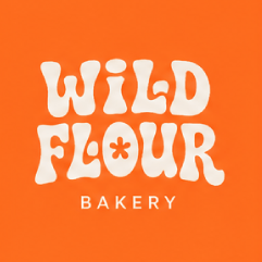
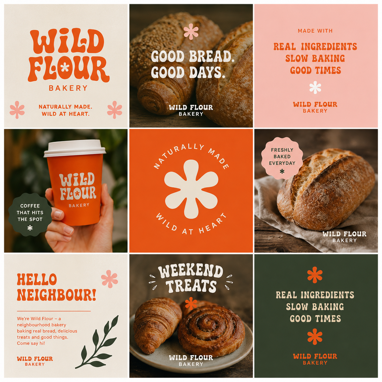
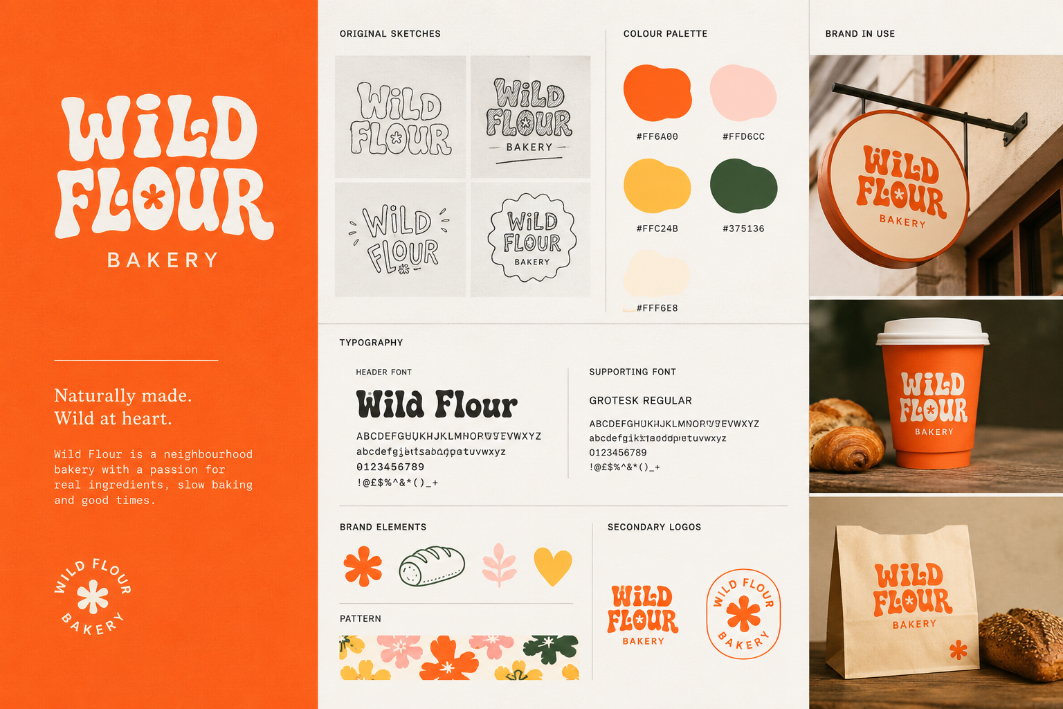
Wild Flower Bakery was a brand-new business looking for an identity that felt as thoughtful and handcrafted as the products they create. With no existing brand to build from, the goal was to create something distinctive, memorable and ready to grow with the business.
What I did.
Starting with a blank canvas, I created a complete brand identity and logo that captured the personality and values behind Wild Flower Bakery. From the colour palette and typography to supporting brand elements, every detail was designed to feel authentic, memorable and timeless.
The finished brand gave Wild Flower Bakery everything they needed to launch with confidence and a visual identity that could be used consistently across packaging, social media and future marketing materials.
"Starting a new business can feel overwhelming, but the branding process was so straightforward. The final identity captures everything we wanted the bakery to be, and we've had so many compliments already.
JULIA SANDERSON - FOUNDER
Castle House Day Nursery - Website design
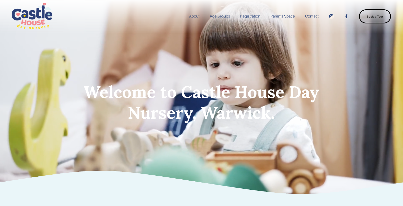
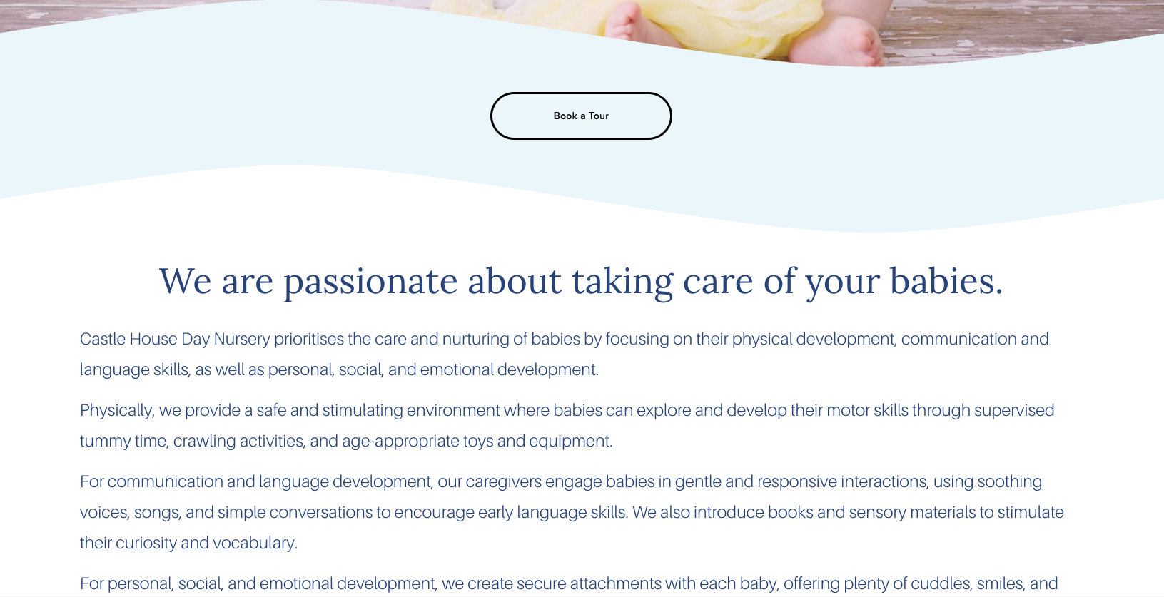
Castle House Nursery had built a fantastic reputation, but their website wasn't making life easy for parents. The navigation felt clunky, important information was difficult to find, and the overall design had started to feel dated.
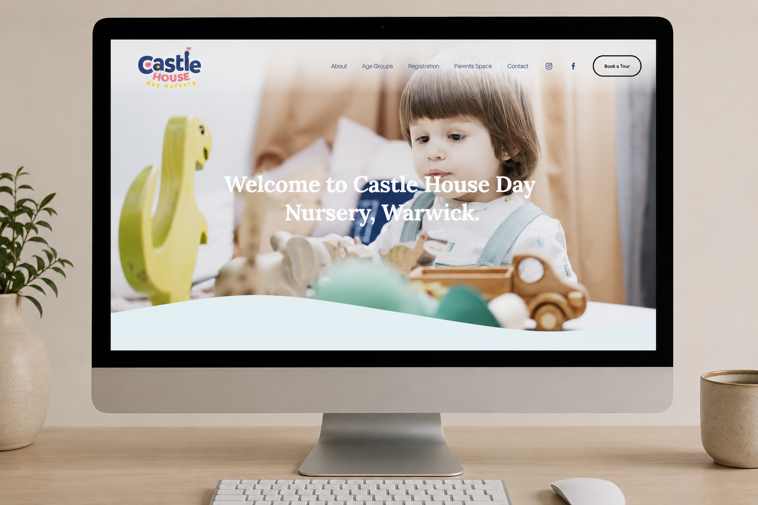
For busy parents, finding key information quickly is essential. The nursery needed a website that was simple to navigate, easy to update and reflected the warm, welcoming environment they've created.
What I did.
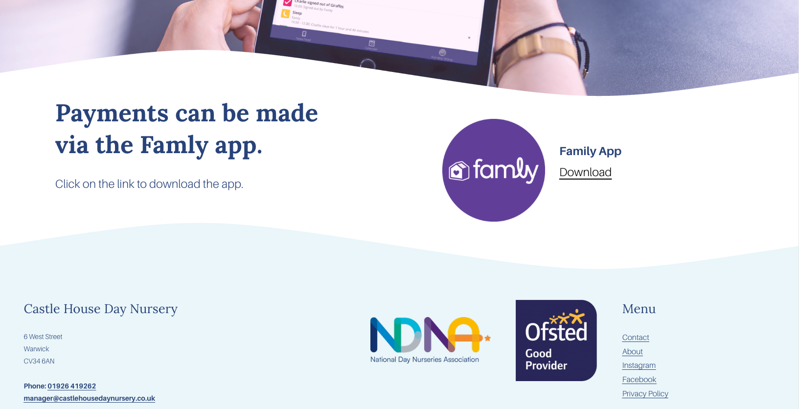
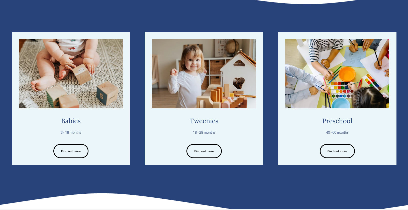
I designed and built a brand-new Squarespace website with parents in mind, creating a much clearer structure and intuitive navigation that makes finding information quick and straightforward.
Alongside a fresh, modern design, I improved the user experience throughout the site, making it easier for parents to explore the nursery, learn about its facilities and get in touch with confidence.
"We knew our website needed updating, but we didn't realise just how much of a difference it would make. Lucy made the whole process so easy, kept us involved every step of the way and created a website that we're genuinely proud of. Parents have already commented on how much easier it is to find the information they need.”
PATSY - OWNER
Nexora IT Solutions — Brand identity & graphic design
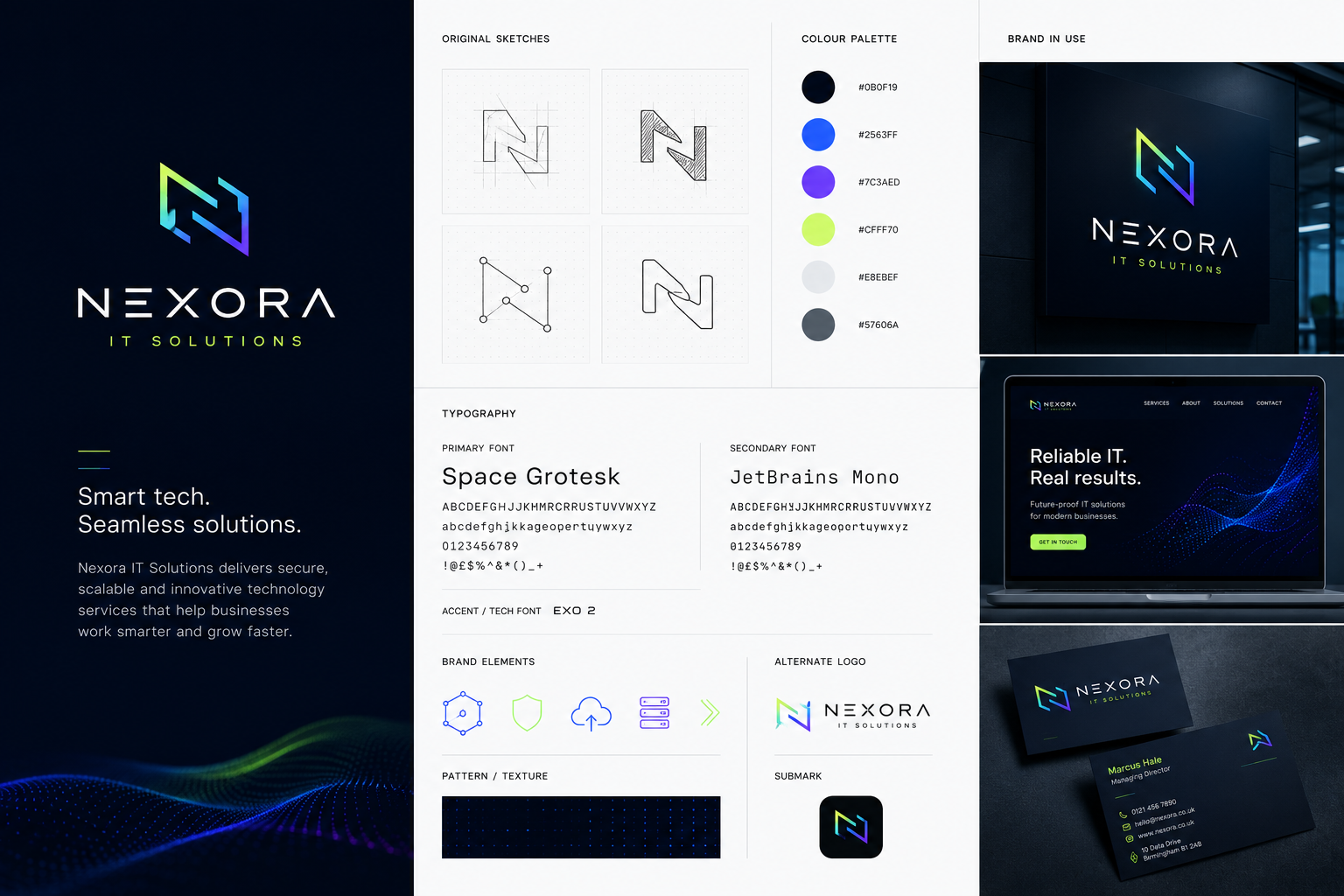
Nexora IT Solutions was a brand-new business looking to make a strong first impression. Starting with a blank canvas, the goal was to create a modern, memorable brand that reflected the company's expertise while standing out in a competitive industry.
As a start-up, it was important that the branding wasn't just a logo. It needed to work across every customer touchpoint, giving the business a professional, consistent look from day one.

What I did.
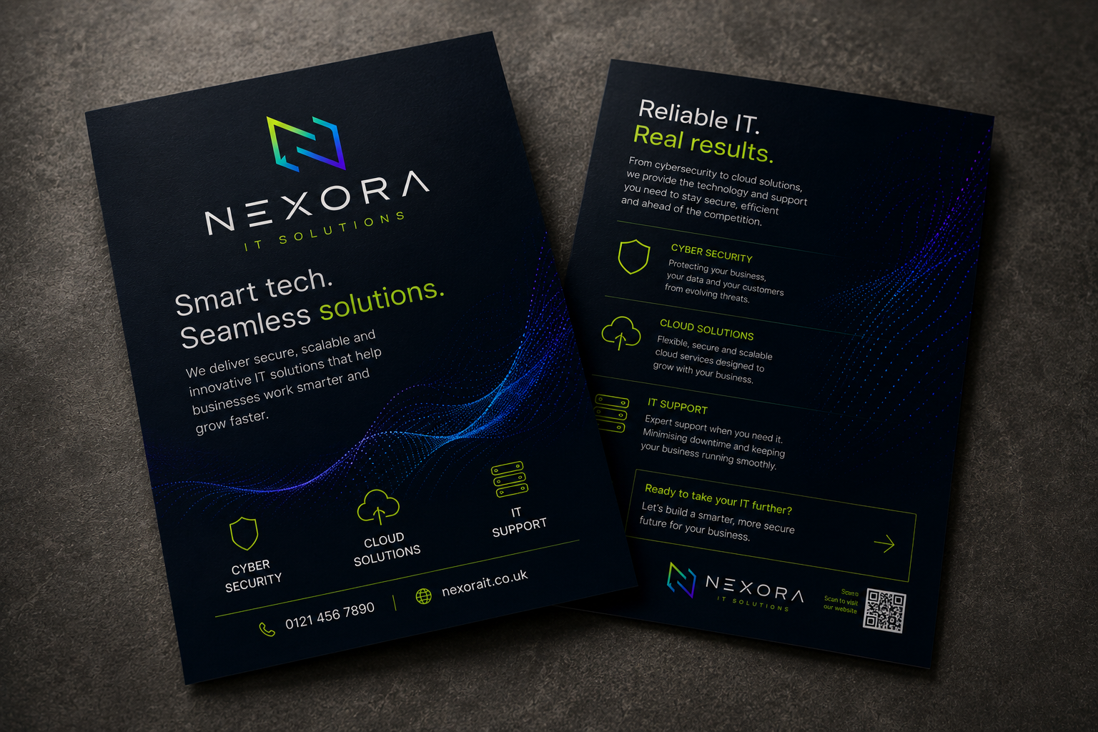
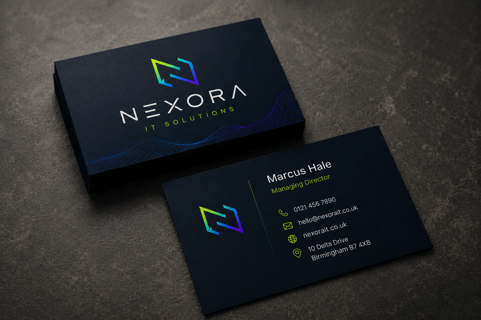
I created the brand identity from the ground up, developing a modern logo, colour palette, typography and supporting brand elements that gave Nexora a bold, recognisable identity.
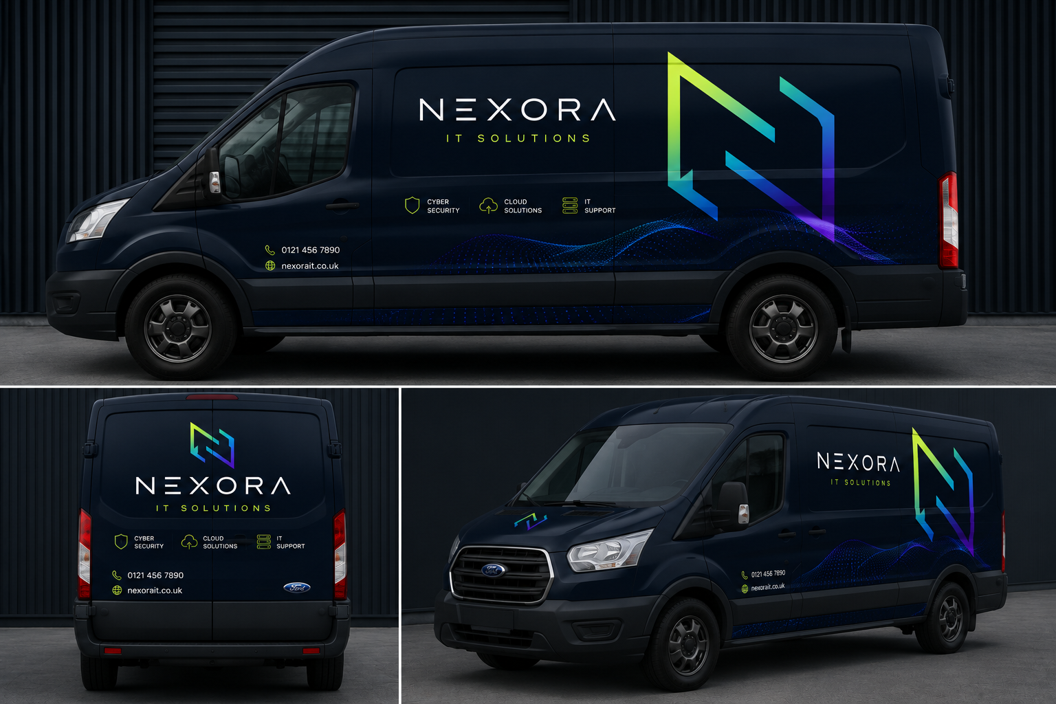
From there, I rolled the brand out across a range of marketing materials, including business cards, vehicle graphics, signage and promotional flyers, ensuring every touchpoint felt consistent and instantly recognisable.
"As a brand-new business, we wanted to get things right from the very beginning. Lucy took our ideas and created a brand that feels modern, professional and completely unique to us. Seeing it brought to life across our van, signage and marketing materials gave us the confidence to launch knowing everything looked consistent and polished."
MARCUS HALE - FOUNDER
Bloom & Brew — Brand identity & graphic design
Bloom & Brew needed a brand identity that reflected the warmth and quality of its offering. Bringing together speciality coffee and fresh floristry, the business wanted to create a destination where customers could slow down, browse beautiful flowers and enjoy expertly crafted drinks in a welcoming environment.
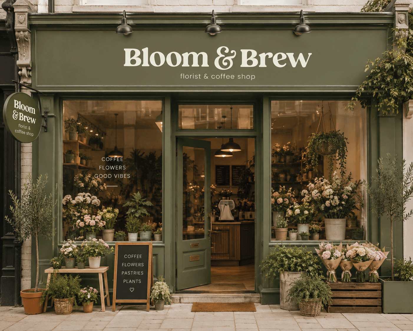
The challenge was to create a visual identity that felt modern, premium and approachable, while avoiding the clichés often associated with florists and coffee shops. Every touchpoint needed to feel consistent, from the shopfront and packaging to social media and signage.
What I did
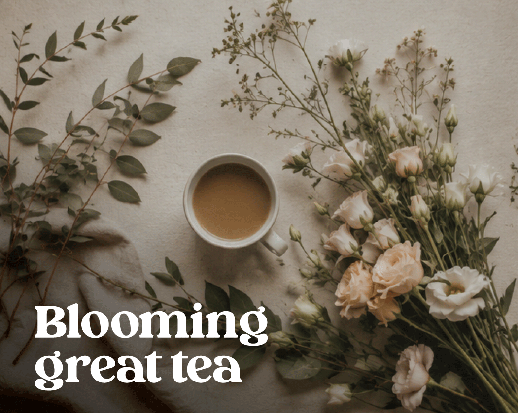
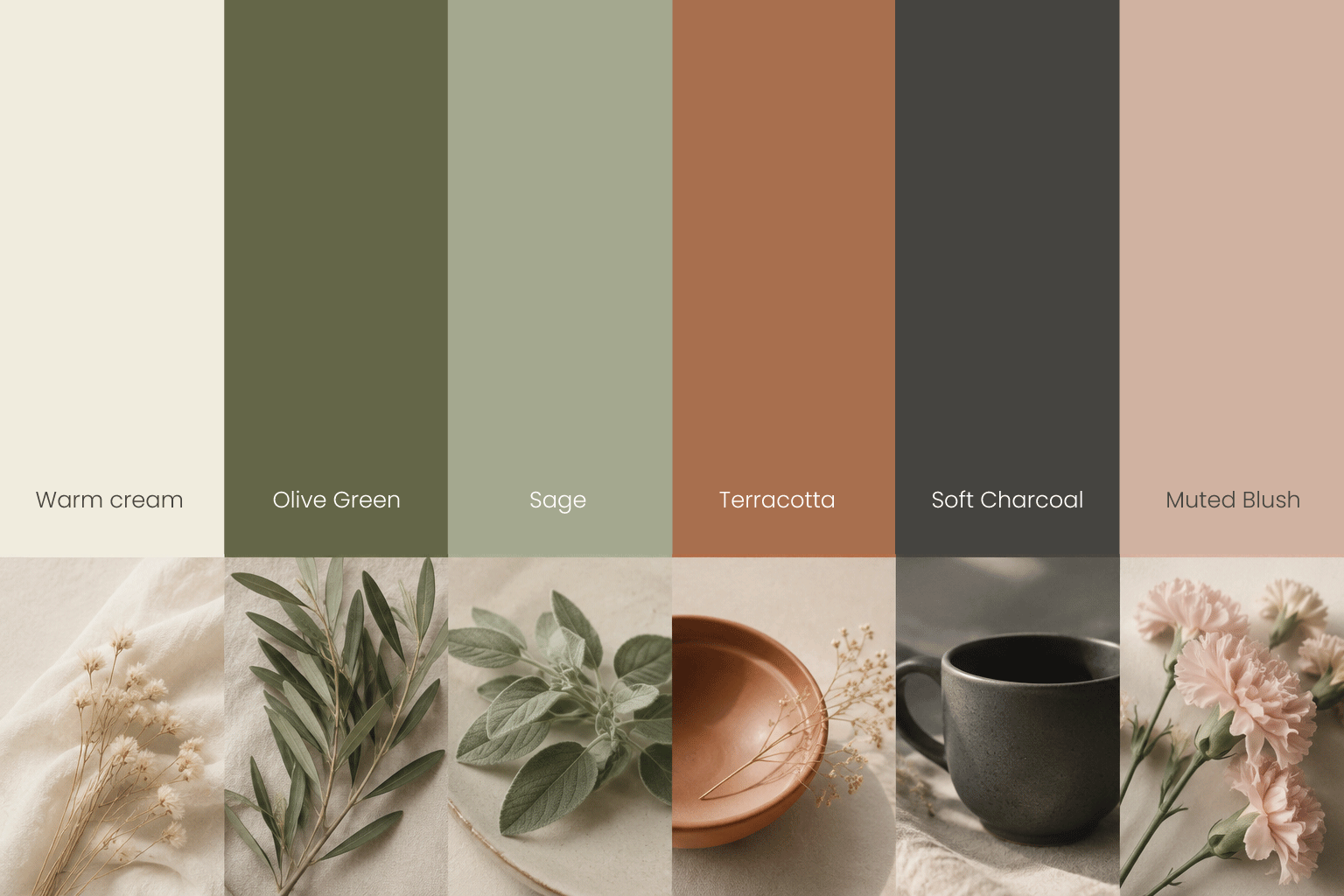
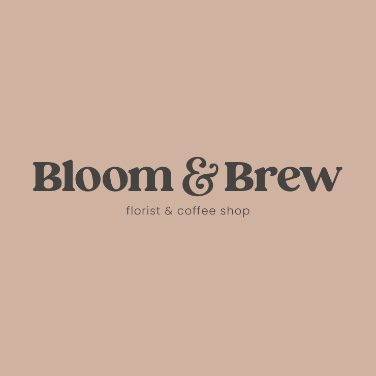
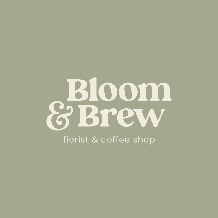
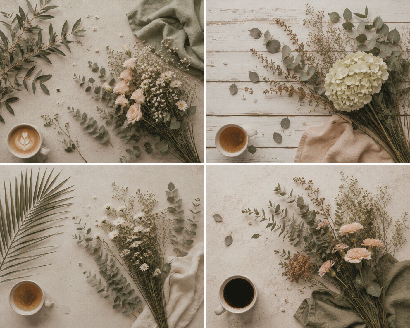
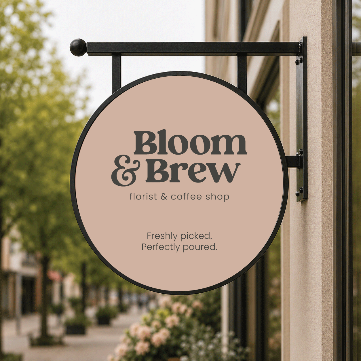
Inspired by nature, the branding uses a palette of warm cream, olive green, sage, terracotta, soft charcoal and muted blush to create a calm, timeless aesthetic. A bold serif logo, paired with clean typography, gives the brand confidence while maintaining a warm, welcoming feel that reflects both the coffee shop and florist.
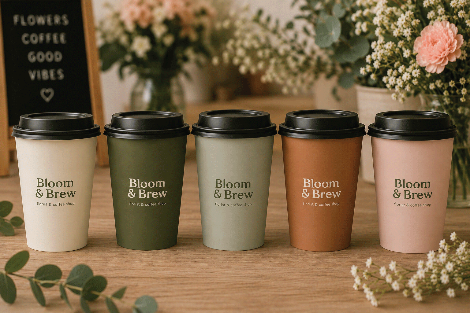
The identity was applied across takeaway cups, business stationery, vehicle graphics, window vinyls, projecting signage and social media, creating a cohesive brand experience at every touchpoint. The result is a lifestyle brand that feels equally at home serving beautiful blooms and brilliant brews, united by the simple idea of "Freshly picked. Perfectly poured."
"The new brand perfectly captures what we wanted Bloom & Brew to feel like. It's warm, welcoming and premium without feeling intimidating. Every touchpoint feels consistent, from the shopfront to the takeaway cups, and we've had so many compliments on the new look."
LISA HUNTING - FOUNDER